Opportunities for (young) creative talent
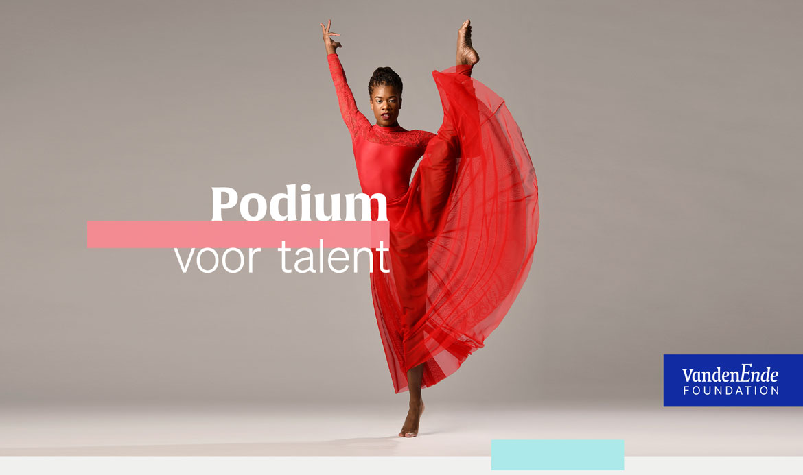
The VandenEnde Foundation (VDEF) is a private cultural fund founded in 2001 by Joop and Janine van den Ende. VDEF contributes to strengthening the cultural climate in the Netherlands, with the aim that young people grow up in a society in which an interest in art and culture is a given.
Setting the stage
VDEF’s mission is to guide entrepreneurship in culture (performing arts, visual arts, and audiovisual media) and offer opportunities for (young) talent to develop further. Individuals are encouraged to use art as a means to make their own lives and those of others more beautiful and valuable. In addition, cultural institutions are encouraged to undertake new initiatives and expand on their entrepreneurial qualities.
Based on this principle, more than a thousand contributions have been made to individuals and institutions since its foundation in 2001, adding up to a total of €193 million.
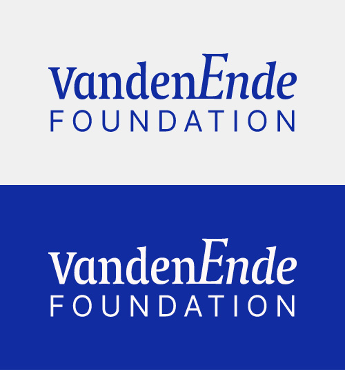
The upper part of the original logotype from Gerard Unger was kept intact. We reused his eclectic font, Alverata (2013), as the base for the new identity
Celebrating Dutch colorful culture
VDEF’s visual identity dated from the 90s and was in need of an update. We were asked to come up with a design that reflected the rich history of the Foundation and did justice to the cultural wealth and diversity that it supports and enhances.
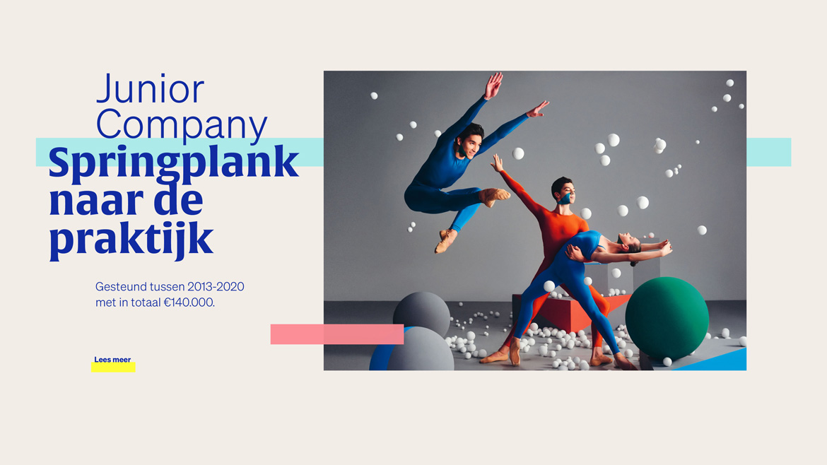
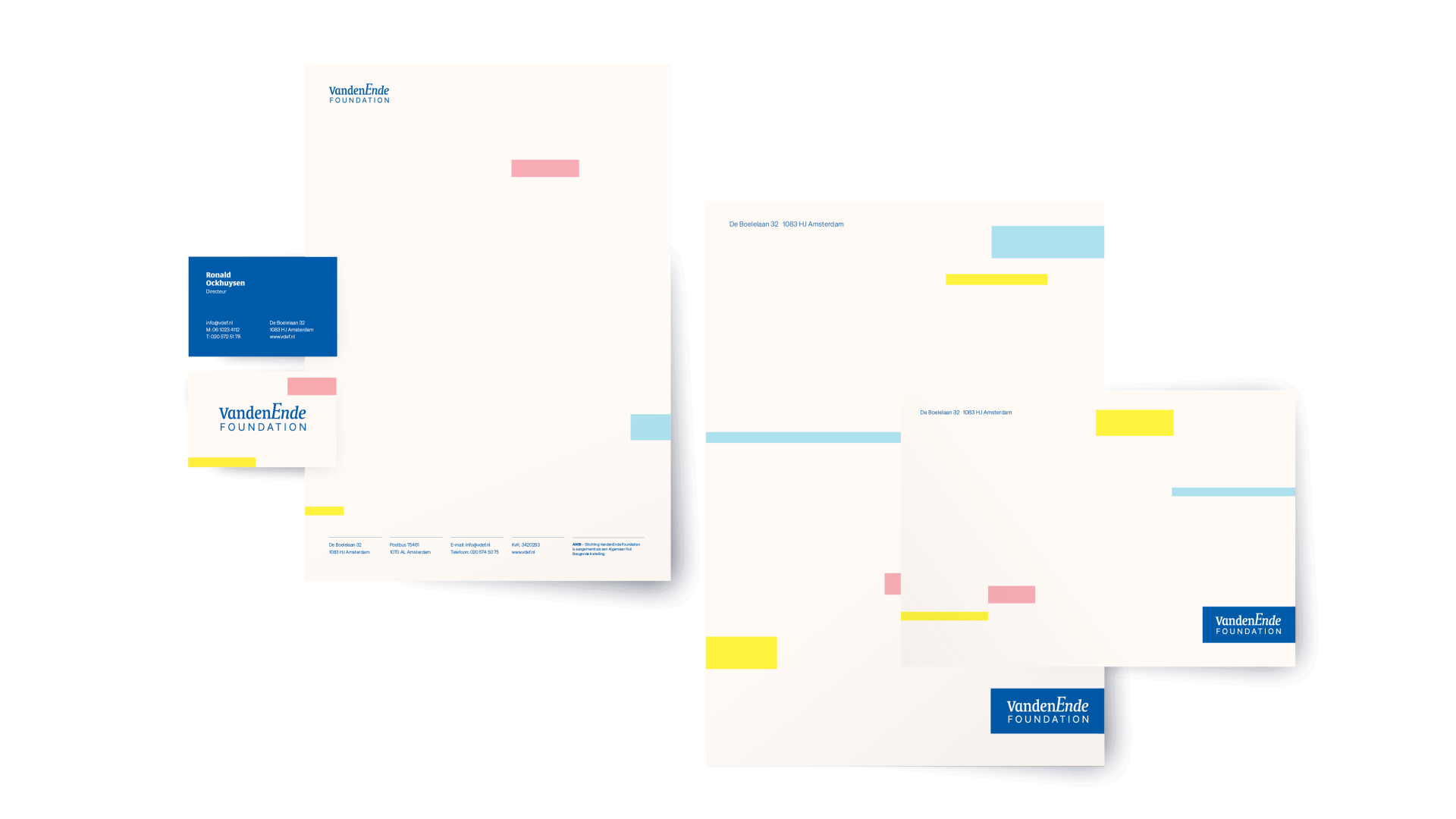
To compliment the subtle updated logotype we designed a festive, graphic language - made out of horizontal bars in various sizes and colours - that represents and celebrates the countless opportunities the Foundation provided over the years.



Annual report
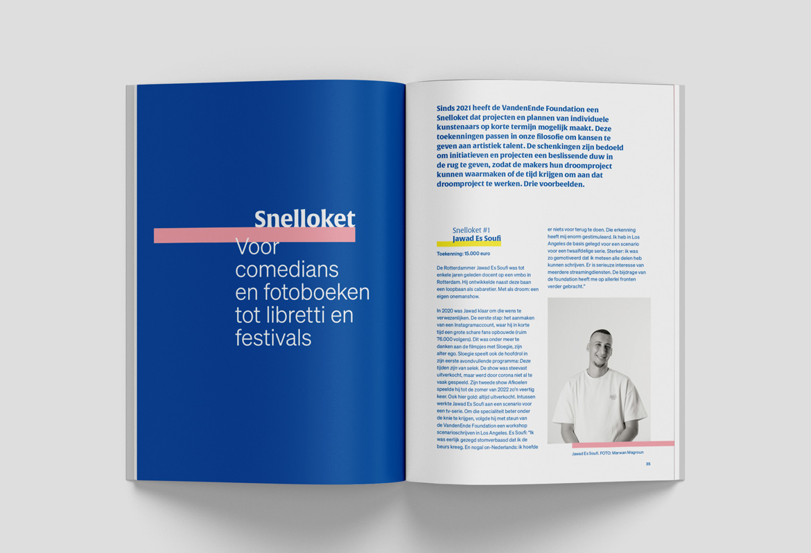
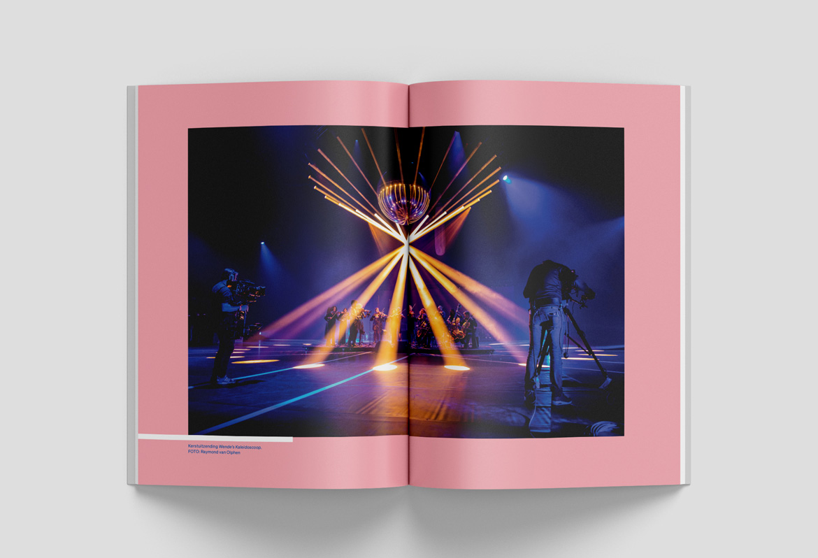
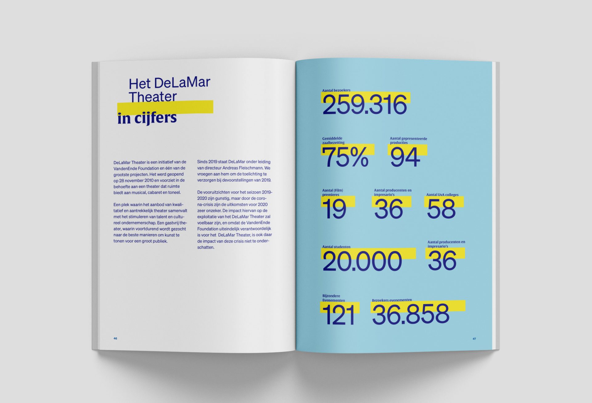
An overview of VDEF's activities and fundings can be found on their website, but also in their printed annual report. As part of the rebranding we also made a new design for the layout. And to make the identity stand out, we used shiny color stamps on the cover.

“Expertise, craftmanship and understanding a client's needs go hand-in-hand at Ape to Zebra. Together we worked on the development of a new visual identity and website, with a beautiful result: exactly what we wanted; more than 'just better' and more suprising.”
— Ronald Ockhuizen, Director
Here we are
Ape to Zebra
